Nimble
Developing a Fast, Flexible Marketing Site for a High-Velocity Startup
Developing a Fast, Flexible Marketing Site for a High-Velocity Startup
Developing a Fast, Flexible Marketing Site for a High-Velocity Startup
Developing a Fast, Flexible Marketing Site for a High-Velocity Startup
Developing a Fast, Flexible Marketing Site for a High-Velocity Startup
Developing a Fast, Flexible Marketing Site for a High-Velocity Startup
Timeline
4 Month
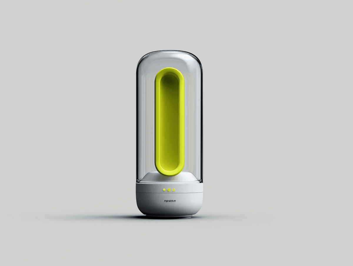
Nimble’s brand needed a fast, modular site to support rapid iteration. We built a flexible framework with reusable components, snappy animations, and clear messaging for scaling without friction.
Nimble’s brand needed a fast, modular site to support rapid iteration. We built a flexible framework with reusable components, snappy animations, and clear messaging for scaling without friction.
Nimble’s brand needed a fast, modular site to support rapid iteration. We built a flexible framework with reusable components, snappy animations, and clear messaging for scaling without friction.
Nimble’s brand needed a fast, modular site to support rapid iteration. We built a flexible framework with reusable components, snappy animations, and clear messaging for scaling without friction.
Nimble’s brand needed a fast, modular site to support rapid iteration. We built a flexible framework with reusable components, snappy animations, and clear messaging for scaling without friction.
Nimble’s brand needed a fast, modular site to support rapid iteration. We built a flexible framework with reusable components, snappy animations, and clear messaging for scaling without friction.
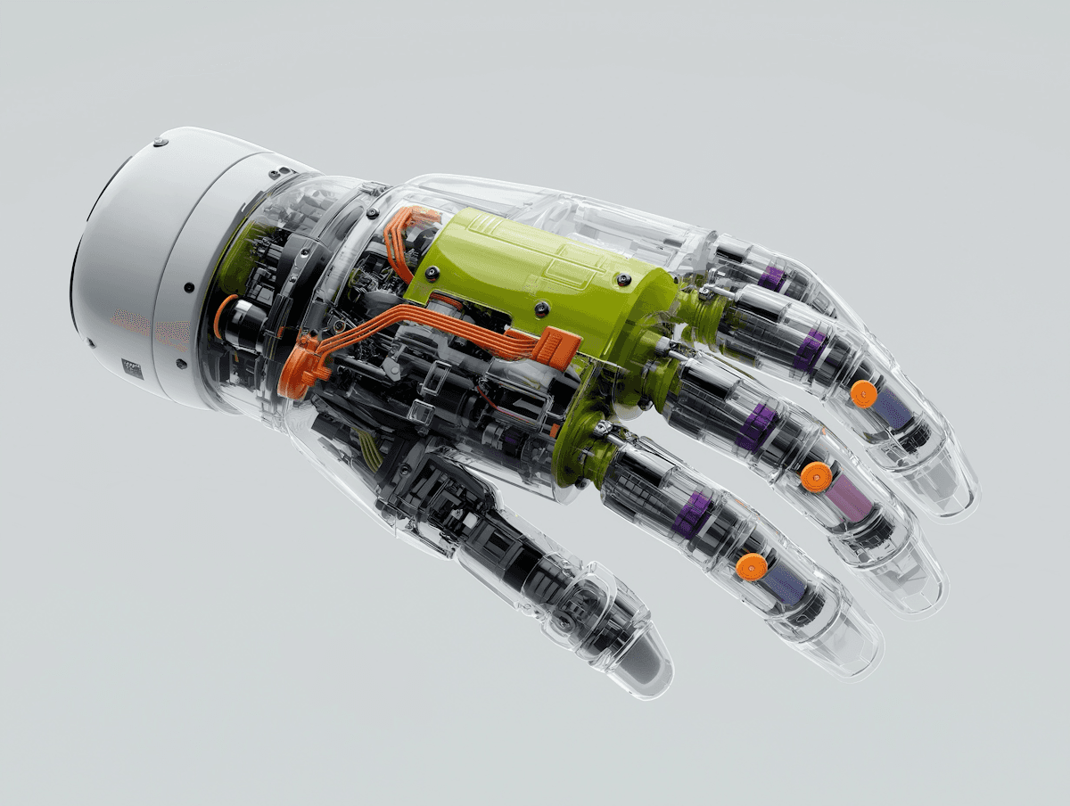
Designing a crypto wallet that feels both familiar to new users and trustworthy to experts, without overloading them with jargon.
Designing a crypto wallet that feels both familiar to new users and trustworthy to experts, without overloading them with jargon.
Designing a crypto wallet that feels both familiar to new users and trustworthy to experts, without overloading them with jargon.
Designing a crypto wallet that feels both familiar to new users and trustworthy to experts, without overloading them with jargon.
Designing a crypto wallet that feels both familiar to new users and trustworthy to experts, without overloading them with jargon.
Designing a crypto wallet that feels both familiar to new users and trustworthy to experts, without overloading them with jargon.
⌜CHALLENGE⌟

⌜APPROACH⌟
We worked closely with their product team to map out simplified flows while embedding micro-interactions to guide users naturally. The dark UI theme with bold typography gave it a strong identity.
Our visual system balanced trust and innovation, and we ensured accessibility and ease of use remained at the core across all devices.
We worked closely with their product team to map out simplified flows while embedding micro-interactions to guide users naturally. The dark UI theme with bold typography gave it a strong identity. Our visual system balanced trust and innovation, and we ensured accessibility and ease of use remained at the core across all devices.