Pause
Creating a Calm and Intentional Landing Page for a Wellness Brand
Creating a Calm and Intentional Landing Page for a Wellness Brand
Creating a Calm and Intentional Landing Page for a Wellness Brand
Creating a Calm and Intentional Landing Page for a Wellness Brand
Creating a Calm and Intentional Landing Page for a Wellness Brand
Creating a Calm and Intentional Landing Page for a Wellness Brand
Timeline
4 Month

Pause needed a digital presence that matched its meditative experience. We developed a soft, fluid interface with subtle transitions, ambient visuals, and carefully paced content to invite users into a state of ease.
Pause needed a digital presence that matched its meditative experience. We developed a soft, fluid interface with subtle transitions, ambient visuals, and carefully paced content to invite users into a state of ease.
Pause needed a digital presence that matched its meditative experience. We developed a soft, fluid interface with subtle transitions, ambient visuals, and carefully paced content to invite users into a state of ease.
Pause needed a digital presence that matched its meditative experience. We developed a soft, fluid interface with subtle transitions, ambient visuals, and carefully paced content to invite users into a state of ease.
Pause needed a digital presence that matched its meditative experience. We developed a soft, fluid interface with subtle transitions, ambient visuals, and carefully paced content to invite users into a state of ease.
Pause needed a digital presence that matched its meditative experience. We developed a soft, fluid interface with subtle transitions, ambient visuals, and carefully paced content to invite users into a state of ease.
The client struggled with inconsistent branding across digital and print channels.
The client struggled with inconsistent branding across digital and print channels.
The client struggled with inconsistent branding across digital and print channels.
The client struggled with inconsistent branding across digital and print channels.
The client struggled with inconsistent branding across digital and print channels.
The client struggled with inconsistent branding across digital and print channels.
⌜CHALLENGE⌟
⌜APPROACH⌟
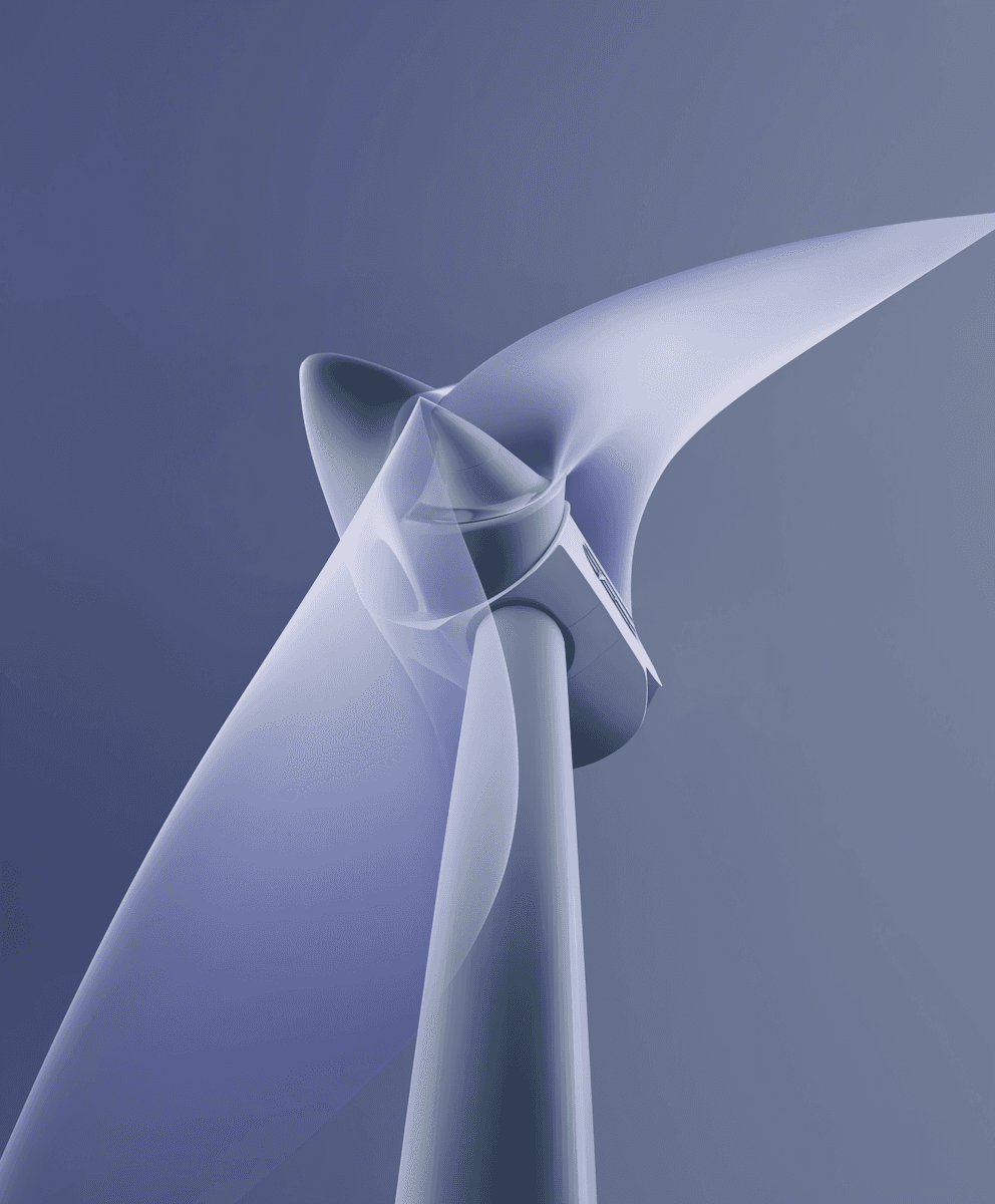
Pause is a meditation and breathwork app designed for people who don’t like typical wellness apps. We were brought on to translate that concept to a landing page that felt fluid and human.
The result is a light, breathable scroll with gently pulsing elements and soft color shifts. It’s more than a landing page—it’s a moment of calm in your tab.
Pause is a meditation and breathwork app designed for people who don’t like typical wellness apps. We were brought on to translate that concept to a landing page that felt fluid and human. The result is a light, breathable scroll with gently pulsing elements and soft color shifts. It’s more than a landing page—it’s a moment of calm in your tab.